|
In This Series:
Preamble
(download .pdf)
Our Intent
(download .pdf)
How Can We Do It?
(download .pdf)
What Do We Expect From Our Selection Criteria?
(download .pdf)
Will We Find Any Significant Trend?
(download .pdf)
What's Under The Hood?
(download .pdf)
Which Stations Are We Sampling?
(download .pdf)

Click the image above to order the Junkman's:
Junk Science Judo: Self-defense Against Health Scares and Scams.
Quick Links
Top Ten 'Most Embarrassing Moments' of 2004!
Junk science?
Junkman?
Short Course
Feedback
E-mail List
Archives & Links
Reading List
Fifth Anniversary
Contact JunkScience.com:
Steve Milloy
(Publisher) or
Barry Hearn
(Editor)
CSRwatch.com / SRIwatch.com

Support JunkScience.com
Shop Amazon.com
Consumer Distorts
DDT FAQ
Malaria Clock
Dioxin in Ben & Jerry's
Capitol Radiation
Our Swollen Future
Ozone 'Depletion'
GreenSpin
NumberWatch
Living Issues
Canada Free Press
|
How can we do it?
To begin deriving some facsimile of global mean temperature (or at least, what it was an hour or two ago), we need a broad data source with what we believe to be largely common sampling and similar format. We need the data to be updated reasonably frequently and at regular intervals. More than that, we need a (more or less) global resource delivered by those with a keen interest in weather and temperature who will deliver consistently over sustained periods. Ideally, that resource will be in our price range (i.e., not exceeding the JunkScience.com lunchroom tea kitty).
So, first decision, what resources are available? Actually, this one’s not too difficult. Most groups publishing temperature trends (we aren’t aware that too many actually publish global mean temperatures) sample perhaps four thousand-odd locations and then spend months adjusting for Urban Heat Island etc. (or trying to). Some comprehensive datasets are available (for a price that somewhat exceeds our tea kitty) but not in raw format and most certainly not in the near-real time requested by our users. One dataset, however, looms large and seems to meet all requirements – NOAA collates and makes accessible airport weather reports, including temperature, from more than six thousand airports and automated met stations around the world, many updated hourly in the METAR database. The news gets better and better – open source software scribes have already written and made available the weather
services PEAR extensions for PHP and so, with open source community-provided Apache server, PHP scripting and MySQL database we have all the tools we need to access what may prove to be a useful data source. To graph the resultant data we are using JpGraph.
We have the source, we have the tools, now, how to use them?
Firstly, we decided to find out what we had potentially available, so we plotted all available listings from the METAR airports database: (click on thumbnails to enlarge)
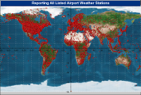 Very impressive but sampling bias already looks to be a potential problem. Next step is to find out which of these locations are actually reporting and thus really available:
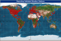
If anything, our situation worsened as some potentially desirable remote locations in the South Atlantic and Southern Ocean disappeared from our dataset (along with almost one-third of our listings) – sad but can’t be helped.
So, now we have a reasonably comprehensive reporting dataset, which ones can we profitably use? A quick back-of-an-envelope calculation reveals we are way short of reporting polar stations compared with the frigid regions’ area by cross section of the Earth. Even if we extend our arbitrary definition of the Frigid Zone from 66°33' to 64° (handy, because it allows direct comparison with IHCN records) we still only have ~160 reporting stations supposedly representing almost 18% of the Earth. If we were going to proportionately sample global temperature that would leave us sampling fewer than 900 sites (we are keen to stay with our self-imposed minimum of 1,000 sampling points). Other problems are immediately obvious in that the southern hemisphere is severely underrepresented and more than half the globe appears not to be sampled at all (about 70% of the planet is ocean).
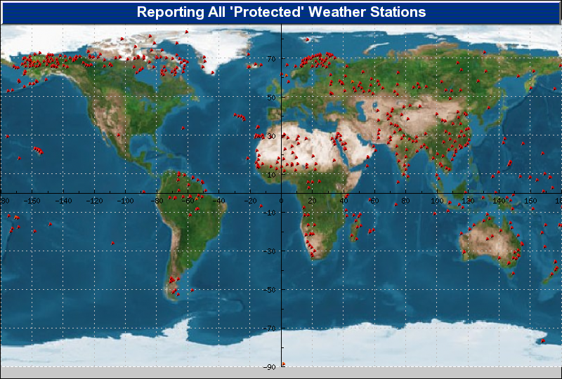
Obviously, we need to reduce some of the over-reporting of better serviced regions while ensuring we preserve the less-well sampled data. We chose to do so by ‘protecting’ various regions (giving them automatic selection into the database of locations to be sampled hourly). We ran a few iterations of this but, as can be seen from the graphic, selection is based on low sampling density.

You can see from the graphic that there is some clustering of sampled regions, particularly in the +64şN region, simply because we are so desperately short of [near-]polar sampling stations.
Having gathered our ‘must-have’ locations, all that remains is to collect a proportionate number of stations from the remainder of the world and take it from there. Granted, we will derive an artificially high global mean temperature simply because we are under-sampling our Frigid Zone but we will accept that in order to maintain a sufficiently large sample base (arbitrarily set here as 1,000+).
<< Previous || Next >>
JunkScience.com
|