9.3.2 Patterns of Future Climate Change
For the change in annual mean surface air temperature in the various cases,
the model experiments show the familiar pattern documented in the SAR with a
maximum warming in the high latitudes of the Northern Hemisphere and a minimum
in the Southern Ocean (due to ocean heat uptake) evident in the zonal mean for
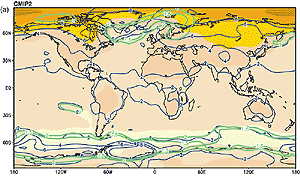
the CMIP2 models (Figure 9.8) and the geographical patterns
for all categories of models (Figure 9.10). For the zonal
means in Figure 9.8 there is consistent mid-tropospheric
tropical warming and stratospheric cooling. The range tends to increase with
height (Figure 9.8, middle) partly due to the variation
in the level of the tropopause among the models. Ocean heat uptake also contributes
to a minimum of warming in the North Atlantic, while land warms more rapidly
than ocean almost everywhere (Figure 9.10). The large
war
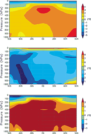
Figure 9.8: Multi-model annual mean zonal temperature change
(top), zonal mean temperature change range (middle) and the zonal
mean change divided by the multi-model standard deviation of the mean
change (bottom) for the CMIP2 simulations. See text for scenario definitions
and description of analysis technique. (Unit: °C). |
|
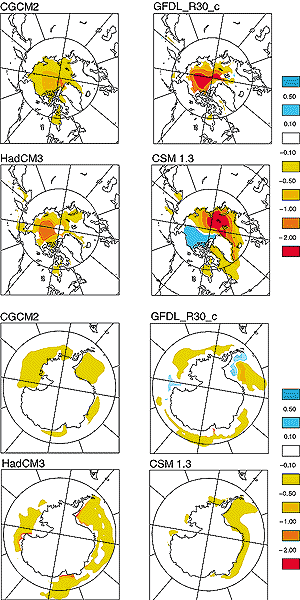
Figure 9.9: Change in annual mean sea-ice thickness between
the periods 1971 to 1990 and 2041 to 2060 as simulated by four of
the most recent coupled models. The upper panels show thickness changes
in the Northern Hemisphere, the lower panels show changes in the Southern
Hemisphere. All models were run with similar forcing scenarios: historical
greenhouse gas and aerosol loading, then future forcing as per the
IS92a scenario. The colour bar indicates thickness change in metres
- negative values indicate a decrease in future ice thickness. |
|
ming in high latitudes of the Northern Hemisphere is connected with a reduction
in the snow (not shown) and sea-ice cover (Figure 9.9).
The ensemble mean temperature divided by its standard deviation { T}
/
T}
/  {T}
provides a measure of the consistency of the climate change patterns (Section
9.2). Different types and different numbers of models enter the ensembles
for the G, GS and SRES A2 and B2 cases and results will depend both on this
and on the difference in forcing. Values greater than 1.0 are a conservative
estimate of areas of consistent model response, as noted in Section
9.2.2 above.
{T}
provides a measure of the consistency of the climate change patterns (Section
9.2). Different types and different numbers of models enter the ensembles
for the G, GS and SRES A2 and B2 cases and results will depend both on this
and on the difference in forcing. Values greater than 1.0 are a conservative
estimate of areas of consistent model response, as noted in Section
9.2.2 above.
There is relatively good agreement between the models for the lower latitude
response, with larger range and less certain response at higher latitudes (Figure
9.10). For example, most models show a minimum of warming somewhere in the
North Atlantic but the location is quite variable. There is a tendency for more
warming (roughly a degree) in the tropical central and east Pacific than in
the west, though this east-west difference in warming is generally less than
a degree in the multi-model ensemble and is not evident with the contour interval
in Figure 9.10 except in the B2 experiment in Figure 9.10e.
This El Nino-like response is discussed further in Section
9.3.5.2.
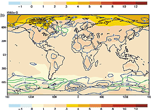
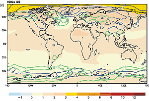
The biggest difference between the CMIP2 G (Figure 9.10a,b)
and GS experiments (Figure 9.10c) is the regional moderating
of the warming mainly over industrialised areas in GS where the negative forcing
from sulphate aerosols is greatest at mid-21st century (note the regional changes
discussed in Chapter 10). This regional effect was noted
in the SAR for only two models, but Figure 9.10c shows
this is a consistent response across the greater number of more recent models.
The GS experiments only include the direct effect of sulphate aerosols, but
two model studies have included the direct and indirect effect of sulphate aerosols
and show roughly the same pattern (Meehl et al., 1996; Roeckner et al., 1999).
The simulations performed with and without the direct sulphate effect (GS and
G, respectively) with the same model are more similar to each other than to
the other models, indicating that the individual response characteristics of
the various models are dominating the response pattern rather than differences
in the forcing. With greater CO2 forcing, the simulated patterns
are more highly correlated in the G simulations than in the GS simulations (Table
9.2, 26 of 36 possible model combinations for temperature, 22 of 36 for
precipitation).
| Table 9.2: The pattern correlation of temperature
and precipitation change for the years (2021 to 2050) relative to the years
(1961 to 1990) for the simulations in the IPCC DDC. Above the diagonal:
G experiments, below the diagonal: GS experiments. The diagonal is the correlation
between G and GS patterns from the same model. |
 |
| Temperature |
CGC M1
|
CCSR/ NIES
|
CSIRO Mk2
|
ECHAM3/ LSG
|
GFDL_ R15_a
|
HadCM2
|
HadCM3
|
ECHAM4/ OPYC
|
DOE PCM
|
|
| CGCM1 |
0.96
|
0.74
|
0.65
|
0.47
|
0.65
|
0.72
|
0.67
|
0.65
|
0.31
|
| CCSR/NIES |
0.75
|
0.97
|
0.77
|
0.45
|
0.72
|
0.77
|
0.73
|
0.80
|
0.49
|
| CSIRO Mk2 |
0.61
|
0.71
|
0.96
|
0.40
|
0.75
|
0.72
|
0.67
|
0.75
|
0.63
|
| ECHAM3/LSG |
0.58
|
0.50
|
0.44
|
0.46
|
0.40
|
0.53
|
0.60
|
0.53
|
0.35
|
| GFDL_R15_a |
0.65
|
0.76
|
0.69
|
0.42
|
0.73
|
0.58
|
0.61
|
0.69
|
0.55
|
| HadCM2 |
0.65
|
0.69
|
0.59
|
0.52
|
0.50
|
0.85
|
0.79
|
0.79
|
0.43
|
| HadCM3 |
0.60
|
0.65
|
0.60
|
0.49
|
0.47
|
0.63
|
0.90
|
0.75
|
0.47
|
| ECHAM4/OPYC |
0.67
|
0.78
|
0.66
|
0.37
|
0.71
|
0.61
|
0.69
|
0.89
|
0.41
|
| DOE PCM |
0.30
|
0.38
|
0.63
|
0.24
|
0.36
|
0.40
|
0.44
|
0.37
|
0.91
|
|
| |
|
|
|
|
|
|
|
|
|
|
| Precipitation |
CGC M1
|
CCSR/ NIES
|
CSIRO Mk2
|
ECHAM3/ LSG
|
GFDL_ R15_a
|
HadCM2
|
HadCM3
|
ECHAM4/ OPYC
|
DOE PCM
|
|
| CGCM1 |
0.88
|
0.14
|
0.08
|
0.05
|
0.05
|
0.23
|
-0.16
|
-0.03
|
0.02
|
| CCSR/NIES |
0.14
|
0.91
|
0.13
|
0.21
|
0.34
|
0.36
|
0.29
|
0.33
|
0.18
|
| CSIRO Mk2 |
0.15
|
0.14
|
0.73
|
0.13
|
0.29
|
0.32
|
0.31
|
0.07
|
0.11
|
| ECHAM3/LSG |
0.20
|
0.23
|
0.13
|
0.39
|
0.28
|
0.19
|
0.11
|
0.11
|
0.29
|
| GFDL_R15_a |
0.18
|
0.20
|
0.28
|
0.28
|
0.41
|
0.28
|
0.20
|
0.22
|
0.21
|
| HadCM2 |
0.34
|
0.34
|
0.23
|
0.37
|
0.24
|
0.73
|
0.19
|
0.24
|
0.17
|
| HadCM3 |
-0.20
|
0.06
|
0.31
|
-0.05
|
0.11
|
-0.01
|
0.81
|
0.25
|
0.09
|
| ECHAM4/OPYC |
0.13
|
0.30
|
0.09
|
0.07
|
0.04
|
0.23
|
0.20
|
0.79
|
0.01
|
| DOE PCM |
0.02
|
0.08
|
0.12
|
-0.09
|
0.06
|
0.13
|
-0.06
|
-0.07
|
0.43
|
|
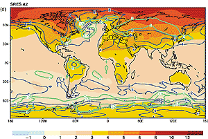
The SRES A2 and B2 integrations (Figure 9.10d,e) show
a similar pattern of temperature change as the CMIP2 and G experiments. Since
the positive radiative forcing from greenhouse gases overwhelms the sulphate
aerosol forcing at the end of the 21st century in A2 and B2 compared to the
GS experiments at mid-21st century, the patterns resemble more closely the G
simulations in Figure 9.10a,b. The amplitude of the climate
change patterns is weaker for the B2 than for the A2 simulations at the end
of the 21st century (Figure 9.10d,e).
Continues on next page