|
|
JunkScience.com's recent climate meddling medley:
JunkScience.com
December 26, 2004
"RealClimate.org" says JunkScience.com is guilty of distortion and data manipulation and, since they obviously need all the help they can get, we're proud to provide a medley of our recent climate meddling, where we manipulate (tabular) data (into graphical format) and willfully distort the global warming industry's scary message.
Monthly meddling - "Global Warming" at a glance (produced as data become available) :
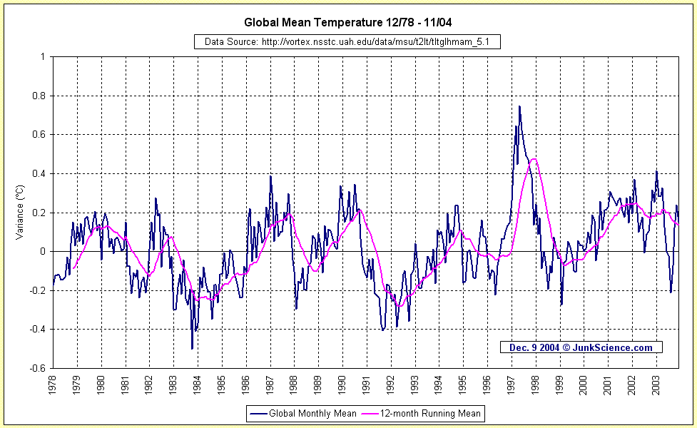 As determined by NOAA Satellite-mounted MSUs
Information from Global Hydrology and Climate Center, University of Alabama - Huntsville, USA
The data from which the graph is derived can be downloaded here
Global Mean Temperature Variance From Average, Lower Troposphere,
November 2004:
+0.151 °C
Peak recorded:
+0.97 °C
February 1998. Current change relative to peak recorded:
-0.25 °C
Best estimate for absolute global mean for 1951-1980 is 14 °C (57.2 °F) Discrepancy between GHCC MSU & GISTEMP November 2004: 0.569 °C
(Northern Hemisphere:
+0.292 °C
, Southern Hemisphere:
+0.010 °C
)
Peak recorded:
+0.746 °C
April 1998. Current change relative to peak recorded:
-0.595 °C
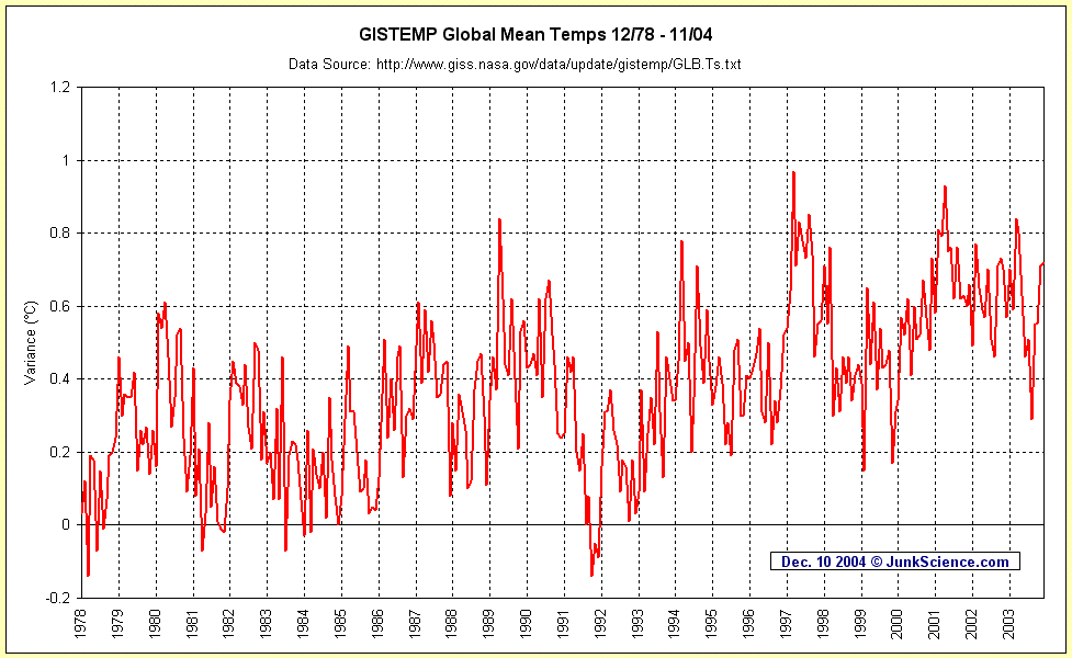 GISTEMP Anomaly November 2004
+0.72 °C
.
GISTEMP Anomaly November 2004
+0.72 °C
.
The data from which the graph is derived can be downloaded here
Estimated absolute global mean November 2004 14.72 °C (58.5 °F)
"What a crock" meddling -
This silliness is everywhere:
"Global warming severest in Arctic: four-year, eight-country scientific study" - "EDMONTON - Global warming is happening twice as fast in the Arctic as anywhere else and could cause everything from the extinction of polar bears to the flooding of large parts of Florida, says a report released Monday. The report, the most extensive ever done on climate change in the North, calls for immediate action on greenhouse gases." (CP)
Also prevalent is: Global Warming Exposes Arctic to Oil, Gas Drilling (Reuters) [We could wish] and all these are based on: Arctic Climate Impact Assessment (ACIA) and their really pretty graphics - it's such a shame they're projections and modeled fantasy but you have to admire the way the atmospheric CO2 representation has been fitted to and overlaid on the 'hockey stick' temperature 'track' - apparently quite wrong but very impressive. Chartsmanship lives!
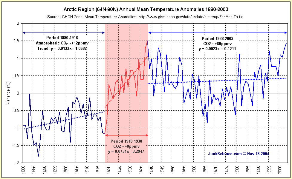 The thumbnail (right) links to a graphic of the annual mean temperature track for the zone 64North-90North taken from here (both links open in a new browser window). Rather obviously there was a significant warming to ~1940 (series max 1938, prior to any significant atmospheric CO2 increase), followed by a cooling persisting into the 1970s (great global cooling scare) and a subsequent recovery to temps similar to those seen 65 years previously. Total zonal warming over 65 years?
-0.06 °C
The thumbnail (right) links to a graphic of the annual mean temperature track for the zone 64North-90North taken from here (both links open in a new browser window). Rather obviously there was a significant warming to ~1940 (series max 1938, prior to any significant atmospheric CO2 increase), followed by a cooling persisting into the 1970s (great global cooling scare) and a subsequent recovery to temps similar to those seen 65 years previously. Total zonal warming over 65 years?
-0.06 °C
There's been no net Arctic warming since 1938. Alternate trend representations here, here and here.
"Immediate response" meddling -
"Stratosphere temperature data support scientists' proof for global warming" - "A new interpretation for temperature data from satellites, published earlier this year, raised controversy when its authors claimed it eliminated doubt that, on average, the lower atmosphere is getting warmer as fast as the Earth's surface. Now, in another study headed by the same researcher to be published Dec. 15 in the Journal of Climate, direct temperature data from other scientists has validated the satellite interpretation." (University of Washington)
Fu has a slight problem - direct measure by radiosonde balloons indicates significantly less atmospheric warming than indicated by satellite-mounted MSUs, which is a very long way from his 40%-70% inflationary reinterpretation. Regardless, the MSU decadal trend is +0.078 °C and thus Fu's 40%-70% inflation would make that in the order of +0.11 °C/decade - +0.13 °C/decade - extrapolating which gives a range of +1.1 °C/century - +1.3 °C/century. To put that another way, Fu's reinterpretation is still short of even the lowest guesstimate of the silly IPCC storylines and well within the realms of natural climate variability.
Trends: Radiosonde Balloon; Microwave Sounding Unit and four major datasets compared.
Data sources where not noted on graphics: Radiosonde "balloon" 850-300 mb (approx 1,000-10,000mtrs) from J. K. Angell, NOAA Air Resources Laboratory, September 2004 and MSU from Global Hydrology and Climate Center, University of Alabama - Huntsville, USA.
"We beg to differ" meddling -
"Climate change sceptics 'wrong'" - "One of the main arguments used by people sceptical of climate change has been undermined by a new scientific study from the UK Meteorological Office. The argument is that measurements of temperature are inherently unreliable because of where weather instruments are situated. Most are in or near cities, which produce their own heat; so the warming they have measured over the last century or so could be down to increasing urbanisation rather than global warming. But a new analysis by Dr David Parker from the Met Office in Exeter shows this 'urban heat island' hypothesis is wrong. Using data for the last fifty years, Dr Parker has created two separate graphs; one plots temperatures observed on calm nights, the other on windy nights." (BBC)
Sorry Dr. Parker, don't agree. Comparing datasets is a great idea - we do it all the time - but directly comparing the datasets looks like this. Clearly, the near-surface amalgam is racing ahead of the measures of the well-mixed atmosphere, which is exactly opposite to what we would expect from enhanced greenhouse, where the atmosphere should warm and the near-surface measure should follow.
While this looks a superficially attractive means of testing for UHIE in the near-surface amalgam record it is apparently flawed (UHIE is well-established as fact, we're only looking at how to remove it from global trend analysis). The bottom line is that purely rural recording stations don't show significant warming (many indicate cooling) and yet urban stations do - the only available hypothesis for this discrepancy being UHIE. Given the magnitude of weather effect observed for cities it is not particularly surprising that windy nights could provide n degrees cooling in both urban and rural environs while leaving intact quite similar if not identical warming curves in the record.
How well does wind "blow away excess heat" from built up areas? Apparently not well enough.
"Extended period and perspective" meddling -
Linked at right is the UK's National Statistics idea of chartsmanship. Their listed data source is Hadley Centre for Climate Prediction and Research - no problem there, that's the repository for the Central England Temperature record (newly updated to February of this year). At this point, however, NatStat seem to have run into trouble.
For a Fifth Avenue perspective see "Warming By Design?"
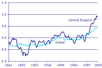 "Temperatures Rising: 4 of 5 record years in England after 1990" - "Both local (central England) and global average temperatures rose during the 20th century." (UK National Statistics)
 Rather than charting the available data series they have produced the above-linked pathetic little cripple - somehow shorn of all perspective and leaving the less well informed with the impression of dramatic, even unprecedented warming occurring in Central England. As can easily be seen in the chart linked at right, virtually identical warming occurred at the beginning of the 18th Century - identical with the obvious exceptions that it occurred much more rapidly then and there had been negligible change in atmospheric carbon dioxide levels. What the record appears to indicate is a slow and ponderous 20th Century recovery from the Little Ice Age. Somehow, we suspect that is not quite the impression NatStat intended to leave viewers of their deceptive little chart.
So, there we have it, five examples plucked from just the last few months. Without doubt we are "guilty" of manipulating digital data to graphical, although nowhere near as prettily as those in ACIA (and we're not likely to in the near future either). Similarly, we "admit" to distorting the global warming industry's post hoc, ergo propter hoc scare campaign regarding atmospheric carbon dioxide by highlighting information omitted by Big Warming and its well-financed cohort of flacks, shills or, as they are more politely termed, lobbyists.
Will we continue to do so?
Count on it.
Copyright © 2004 JunkScience.com - All Rights Reserved.
This article, including graphics, may be reprinted in full or in part with attribution.